Making wine pairing magical
Wineally’s wine pairing app had low adoption. Built first for waiters, it confused consumers, and it looked cheap and messy for a product that sells wine. I redesigned it around how a consumer thinks, based on user research instead of engineering constraints.
I was the sole designer, in-house. The redesign was designed and tested but never built: Wineally ran out of funding.
Year
2023
Duration
3 months
Client
Wineally AB, Sweden (through EC solutions)
Engagement
Sole designer; never built
Role
- UX research
- Wireframing
- Testing
- Visual design
The problem
Wineally had a very low adoption rate on their wine pairing mobile app. The first version was focused on waiters at a restaurant and needed to be rethought to work for consumers.
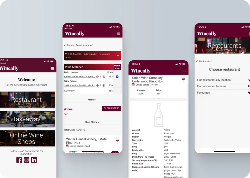
The little feedback they had was not positive: users had a hard time figuring out what the app was for and how to use it, and the look did not match the brand or the people it was meant for.
The goal was to increase adoption by rethinking the user flows to match what users want and expect, and by redesigning the visual look to be more appealing to the target market. No new functionality would be developed at this stage.
What was going wrong
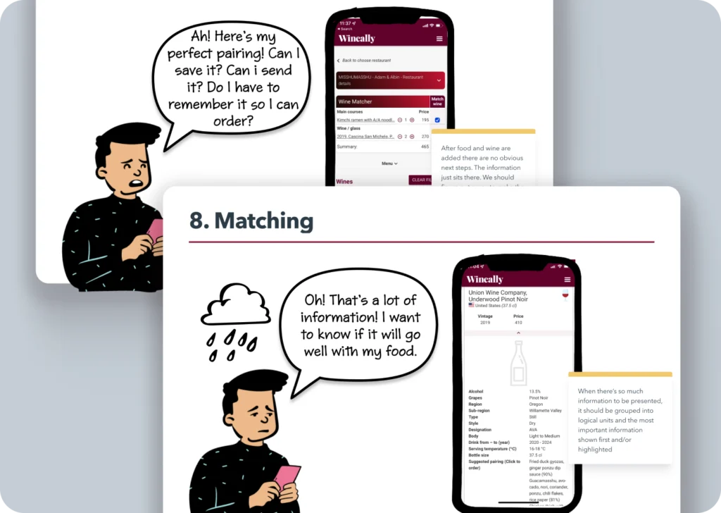
By creating the user story of a current app user, I helped stakeholders empathise and identify the concrete pain points in the existing flows, and got buy-in for the redesign. The main problems:
- Confusing, complicated and unappealing onboarding
- Visual problems with hierarchy, grouping and consistency
- A matching flow modelled on shopping, but with no “checkout” or outcome shown
- No “magic”: the result felt underwhelming
What users wanted
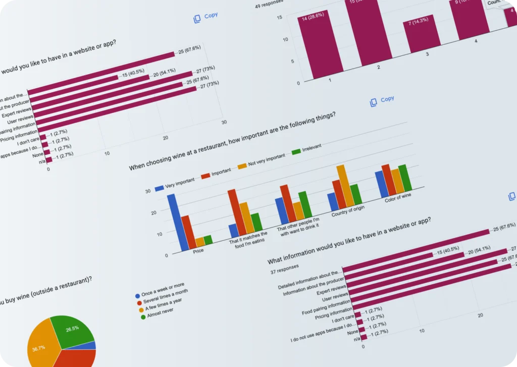
We ran a survey with 48 participants about their dining and wine habits, their experience with wine recommendation apps, and the functionality and information they wanted.
It showed which information potential users find useful when choosing a wine, and what other apps were doing right.
The decision: think like a consumer
User flows
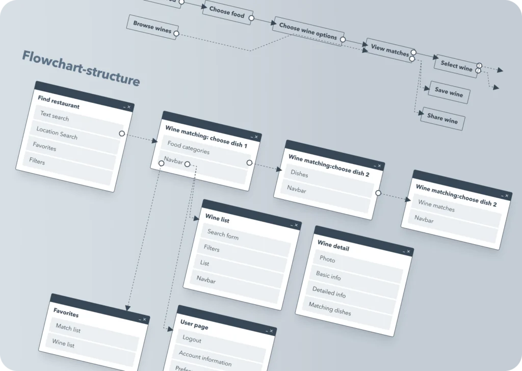
The first version was shaped by how the system worked and how waiters used it. I started from how a consumer thinks and what they want, based on the research and not on engineering constraints.
I broke user goals into specific tasks, grouped them into screens and created logical flows, a blueprint for the interface.
Auditing what stays
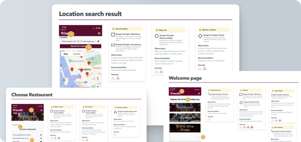
For the flows that would be kept (login, onboarding, venue choice), I did a heuristic UX evaluation to pinpoint the usability problems and possible solutions.
Wireframes and prototype
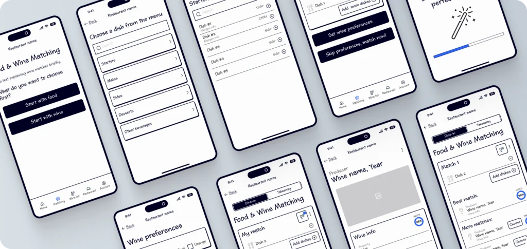
Based on the flows and the evaluation, I created wireframes for each flow and then a prototype, which let us see the page structure and refine the flows and functionality.
Testing the prototype
What the test showed
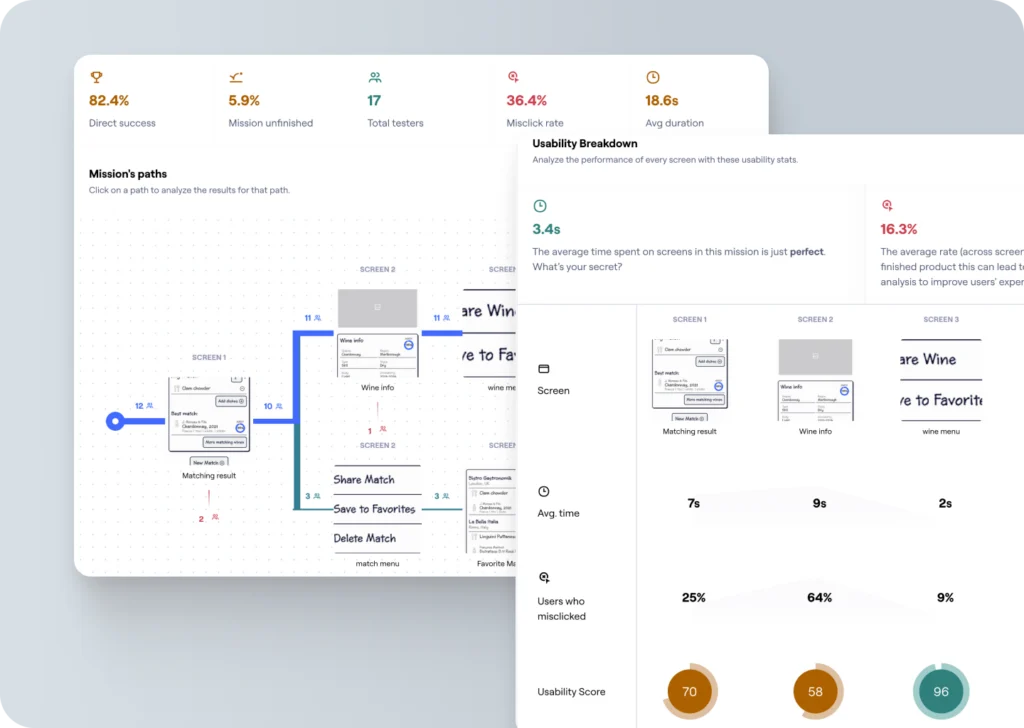
I ran a remote unmoderated usability test with 20 users: three tasks (choosing, choosing wine options and matching, adding to favourites), a rating of how easy each felt, and open feedback.
On the main mission, 82.4% of testers succeeded directly and 5.9% did not finish. The weak spot was the wine info screen: 64% of users misclicked and its usability score was 58, so that is the clearest thing to fix next.
Visual design and reusable components
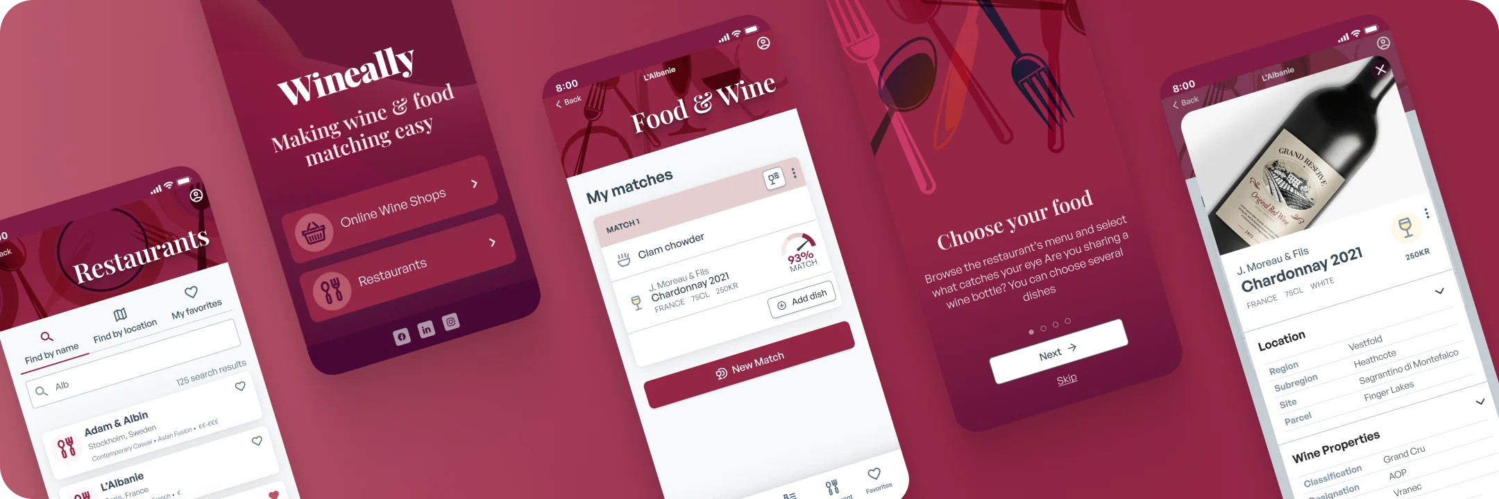
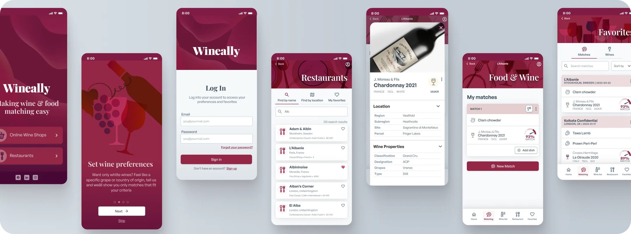
With the wireframes as a starting point, I developed the app interface, keeping the brand’s visual elements but with an updated look that is easier to use. I used established mobile design patterns that would be familiar to users, and built reusable design components that could be the base for all future development.
The new app is more streamlined, showing only the elements relevant to the current task, and the structure and look help users navigate. The visual style matches the brand better and gives a more exclusive feeling.
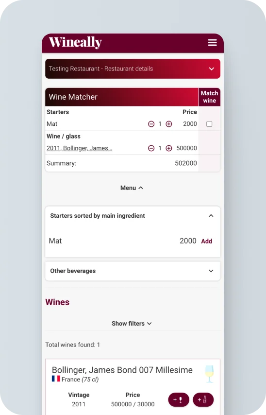
Before and after
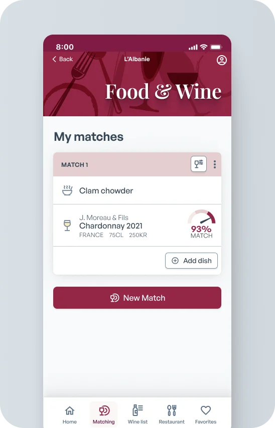
Wine & food matching
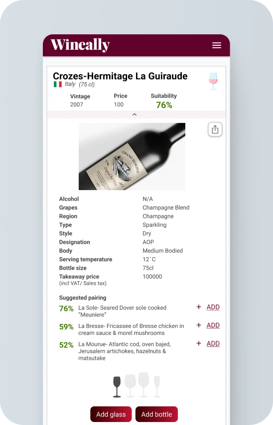
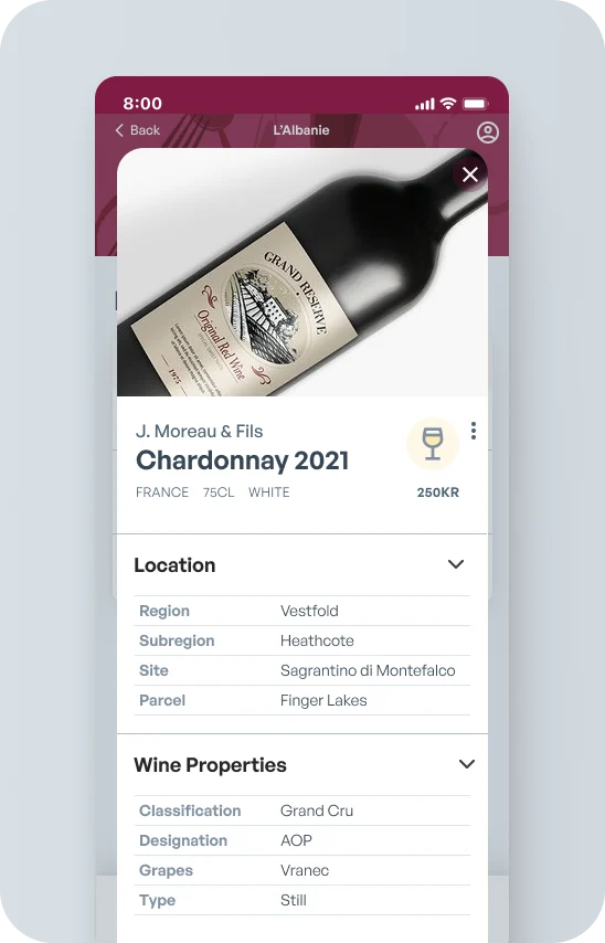
Wine details
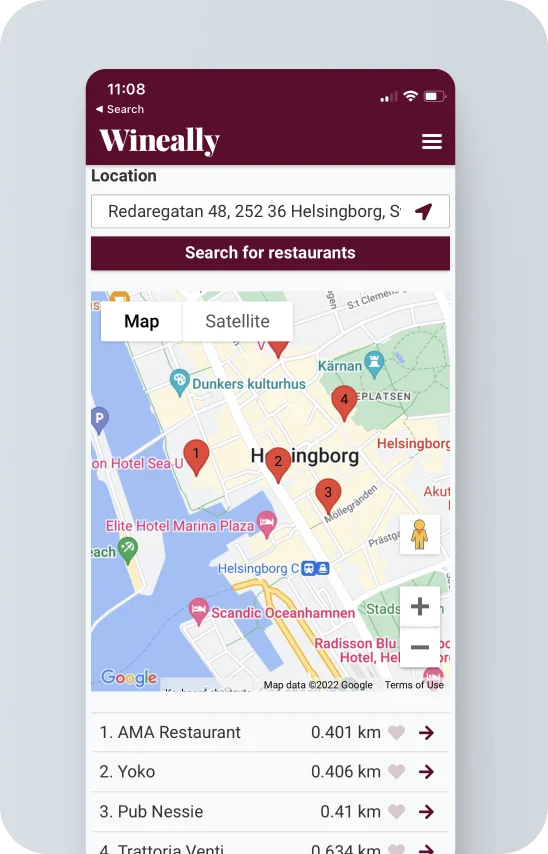
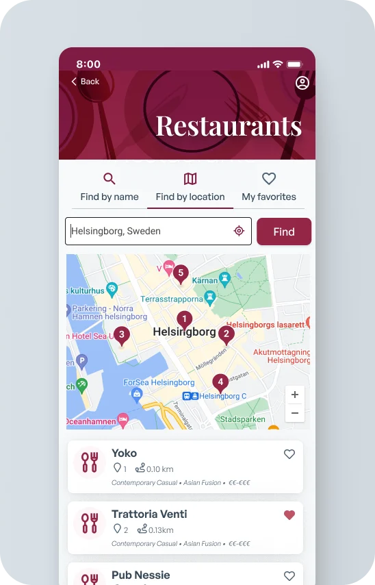
Restaurant search
What changed
- Flows and functionality that match the users’ mental model and are more intuitive
- A simplified interface that makes the relevant information easy to find
- Modern, attractive styling that matches the target market better
- Results presented in a more straightforward and appealing way, raising the app’s perceived value
What happened
Wineally ran out of funding before the app could be developed, so it never launched and there is no adoption data. The prototype test is the evidence I have: it showed the redesign was usable, and where it still needed work.
Same client, a different problem: an internal tool instead of a consumer app.
Interested in a project like this?
Tell me about yours, or keep looking through my work.