Uncorking Efficiency: Wineally’s Backoffice Suite
Wineally maintains a large body of data on wine producers, merchants, wines, pairings and restaurants. Adding, reviewing and maintaining it was unwieldy, because the interface had grown alongside the database and was never designed around the people using it.
I redesigned it as the sole designer, working with Wineally’s developers and wine data team.
Year
2023
Duration
3 months
Client
Wineally AB, Sweden (through EC solutions)
Engagement
Sole designer
Role
- UX research
- Wireframing
- Testing
- Visual design
- Design system
The problem I found
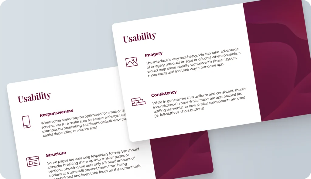
I analysed the existing backoffice from usability, accessibility and branding perspectives. The interface mirrored the structure of the internal database instead of the tasks people needed to do, so finding, adding and reviewing data meant working around it.
Understanding the internal workflow and how people actually used it shaped the direction of the redesign.
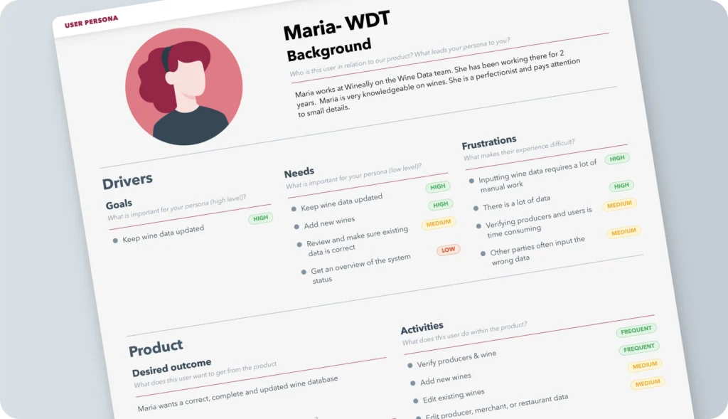
Different users, different jobs
Talking directly with Wineally employees gave me insight into their specific needs, challenges and preferences.
Through them I could understand what each type of user needed, and design for their distinct roles and requirements.
The hard part: wines
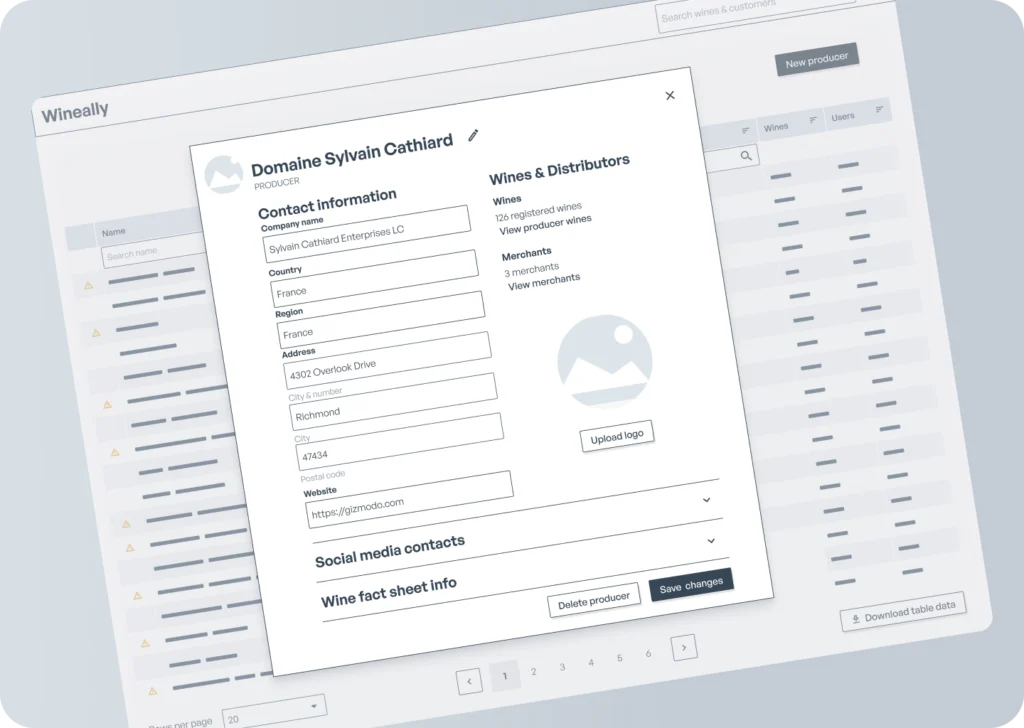
Managing wines was the hardest problem. The amount of information mapped to each producer, wine and vintage was not easy to visualise, and it all had to stay searchable and editable.
I iterated on user flows and low-fidelity wireframes together with the developers and the wine data team to find the right solution, prioritising ease of use and intuitive search and navigation.
Visual design and a design system
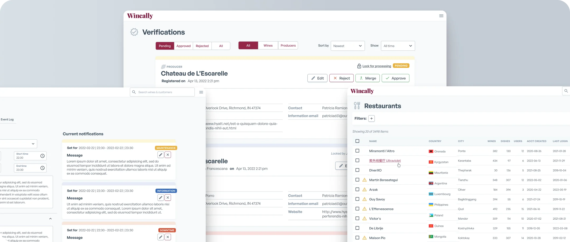
The previous version was cobbled together from different components and styles. I created a simple, harmonious and visually clear design system, so every element works the same way wherever it appears.
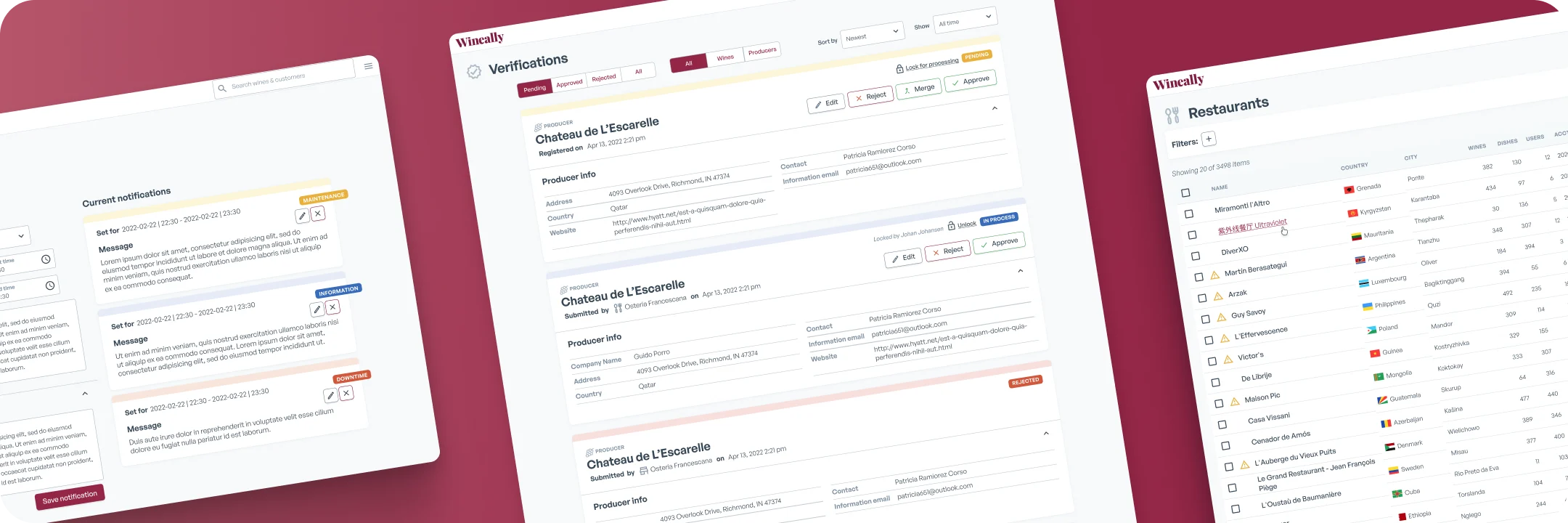
The new backoffice is task-focused. The structure and flow help admins more efficiently find and edit the information they need to. The visual style feels modern and familiar to users.
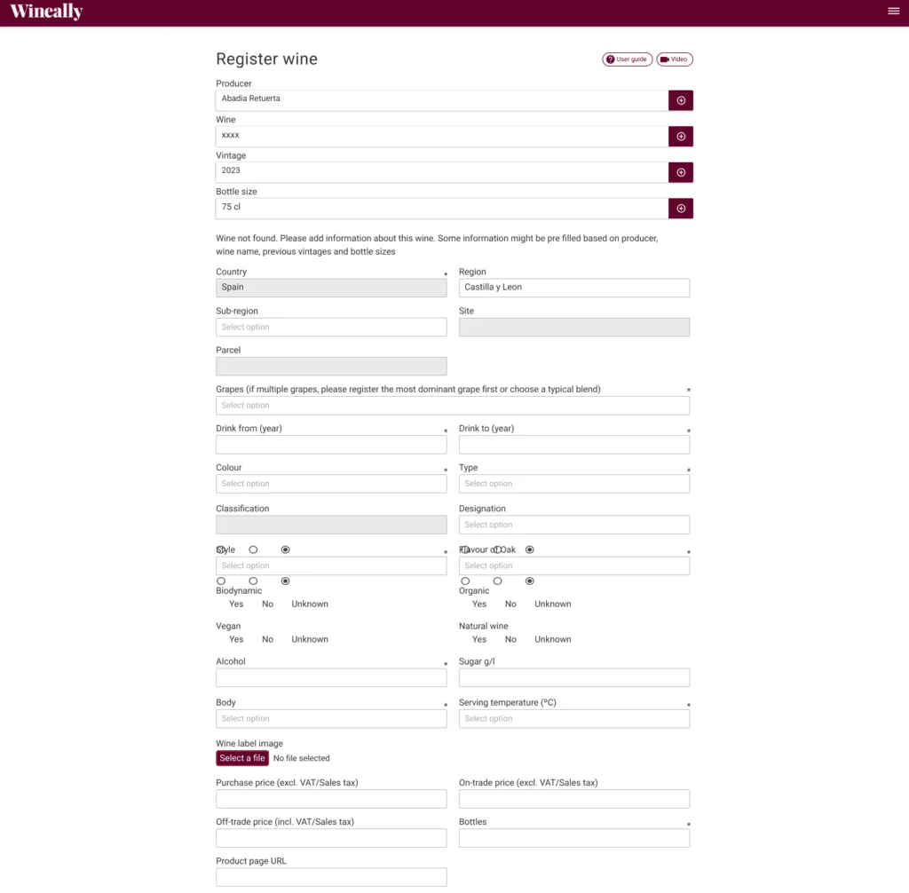
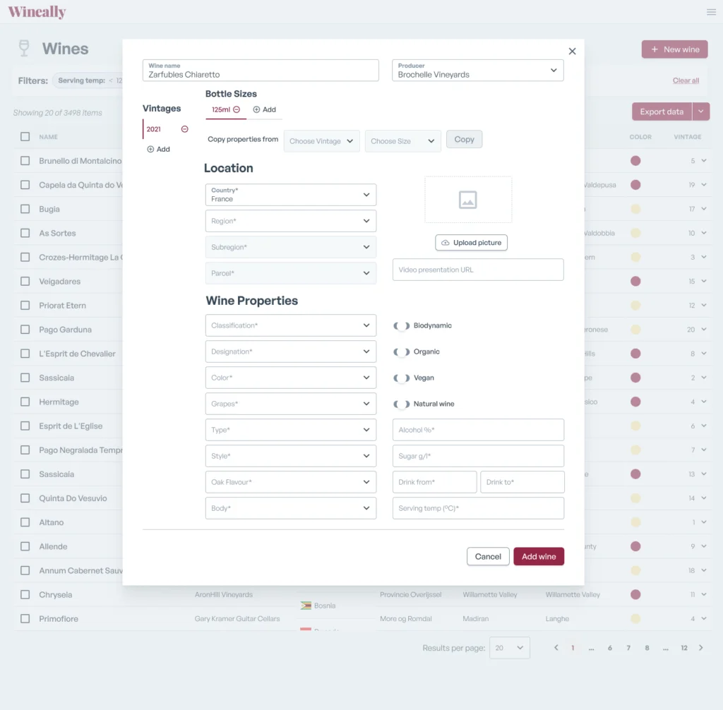
The wine registration form, before and after the redesign.
What I delivered
- Prioritised search & sort: a streamlined interface that makes it easy for the team to find what they need, when they need it.
- The right information in the right place: simpler administrative tasks.
- Optimised editing flows: a more user-friendly and efficient administrative tool.
- A modern, consistent look: one design system across the whole interface.
What the wine data team said
The team could input data much quicker, spot inconsistencies and errors, and get an overview of the existing data.
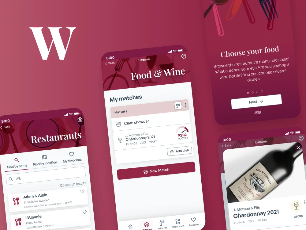
Same client, a different problem: a consumer app instead of an internal tool.
Interested in a project like this?
Tell me about yours, or keep looking through my work.