Wellbefy is on a mission to boost corporate health by keeping an eye on employees’ well-being. They don’t just track health stats – they offer activities, share knowledge, and measure the impact. But their dashboard wasn’t giving a clear overview, and users couldn’t easily figure out what to do next. Our team set out to resolve these issues through a comprehensive redesign.
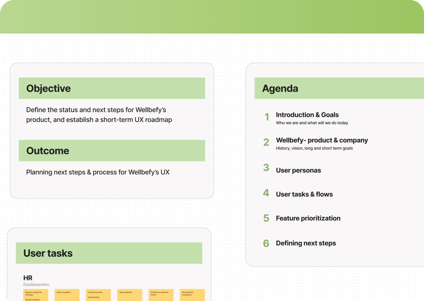
Our process began with a discovery workshop, a crucial step to align our objectives with Wellbefy’s vision. During this interactive session, we engaged with Wellbefy’s team to understand their goals, challenges, and expectations for the new dashboard. Additionally, we collected valuable insights about various user groups to pinpoint the primary issues with the current dashboard.
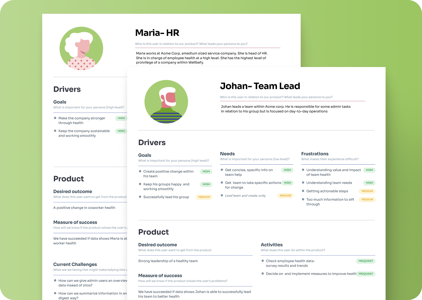
2. Persona Creation – Understanding Our Users
The next phase involved creating detailed personas for Wellbefy’s diverse user base. These personas went beyond simple demographics; they encapsulated the users’ needs, pain points, and interaction patterns with the dashboard. This step was vital to ensure our design solutions would cater effectively to all user types, from HR managers to individual employees.
3. UX Design – Creating an Efficient Experience
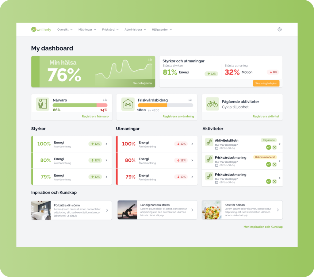
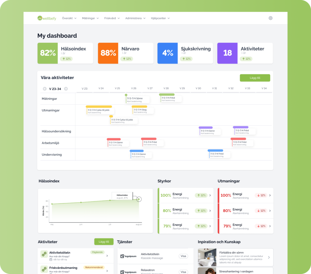
Armed with our personas, we proceeded to the UX design stage. We developed wireframes and prototypes, iterating continuously to refine the user experience. Our main focus was on making the dashboard intuitive, visually appealing, and most importantly, actionable. Users needed to log in, receive a comprehensive overview of their health status, and easily identify the next steps to take.
The design was made to match Wellbefy’s existing ui framework (Tailwind) to make implementation painless.