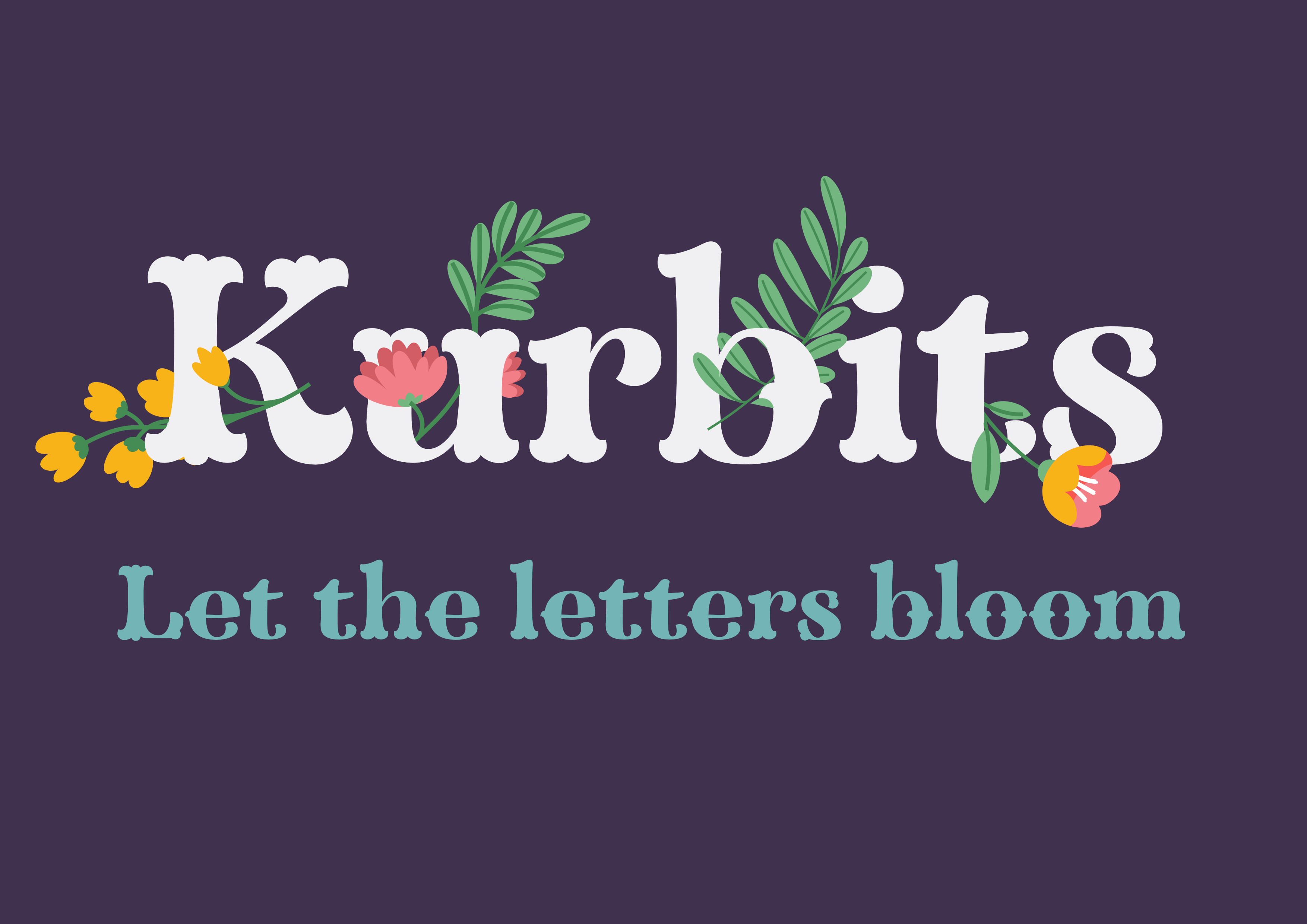
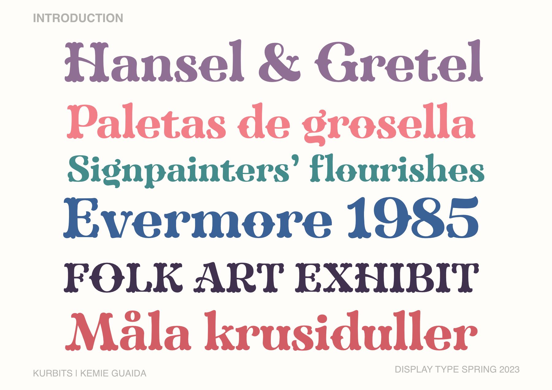
Inspired by the ornate forms and brushstrokes of Mexican & Scandinavian folk art, Kurbits- named after a swedish word for flourishes- is a different take on tuscan typefaces. The result is a high contrast, bold typeface for display & branding.
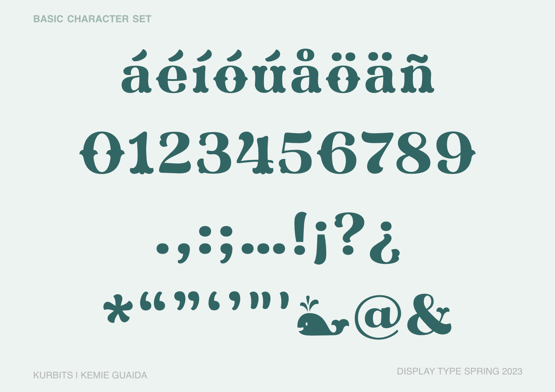
Kurbits ended up being somewhere in between a didone and a traditional tuscan face. It was a challenge to figure out a system where the ornaments would make sense, and be exhuberant enough but not overwhelming.