Wineally wanted everyone to perfectly match food & wine. With an impressive wine database and matching algorithm, they had the foundations for a great product. However, adoption of their app was slow and they needed to find out a way for their users to fall in love with wine matching.
Read on to see how I worked with them to align their app with their users’ needs.
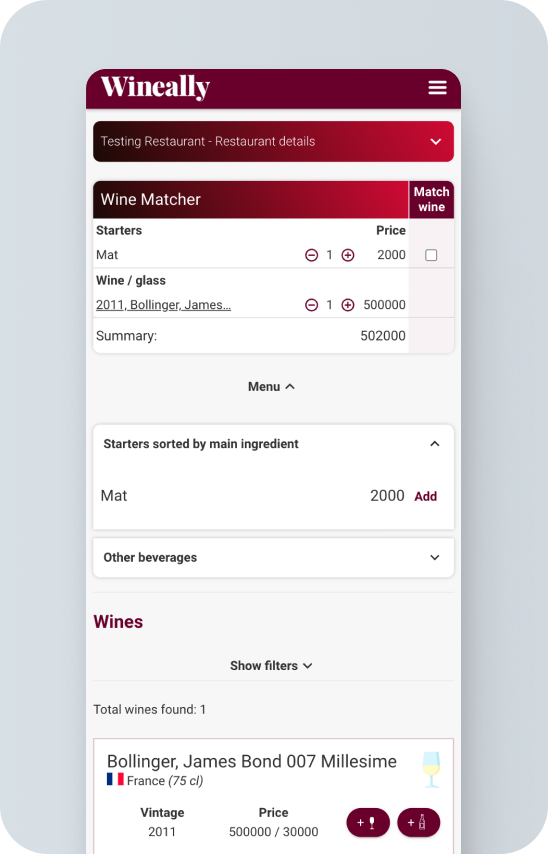
Wineally had a very low adoption rate on their wine pairing mobile app. The first version of their app was focused on waiters at a restaurant and needed to be rethought to work for consumers.
The little feedback they had was not positive as users had a hard time figuring out what the app was for and how to use it.
Desired Outcome
By rethinking the user flows to better match user goals & expectations, and the redesigning the visual look of the app to be made more appealing to the target market, Wineally intended to increase adoption of their app. No new functionality would be developed at this stage
User story
By creating the user story of a current app user, I was able to help stakeholders empathize and identify the concrete pain points in the existing flows and got buy-in for the UX redesign.
Outcomes
I identified the following main problems:
Confusing, complicated and unappealing unboarding
Visual problems with hierarchy, grouping and consistency.
The matching flow was based on a shopping process, but there’s never any “checkout” or outcome shown
There is no “magic”, the result feels underwhelming
Quantitative analysis
We ran a survey with 48 participants, to get information about their dining & wine consumption habits, experience with wine recommendation apps, and desired functionality and information.
Outcomes
We got insight on the type of information potential users found useful to choose a wine, and what other apps were doing right.
2. Ideation & iteration
User flows
Based on the research I broke down user goals into specific tasks, grouped them into screens, and created logical flows.
Outcomes
We now had a blueprint for starting to visualize the UI with all the elements and functionality needed
Ux audit
For the existing flows that would be kept in the redesign (login, onboarding, venue choice), I did a heuristic UX evaluation, pinpointing the usability problems present and possible solutions.
Outcomes
I identified the problems and areas of opportunity to be tackled in the redesign
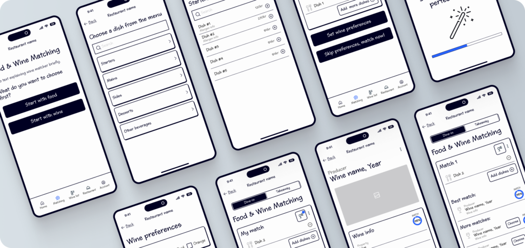
Wireframes
Based on the user flows and heuristic evaluation, I created wireframes for each flow, and then created a prototype
Outcomes
The wireframes allowed us to visualize the page structure and refine the flows and functionality of the app
User testing
We ran a remote unmoderated usability test with 20 users. The test consisted in 3 tasks (choosing tasks, choosing wine options & matching, and adding to favorites), evaluation on the percieved ease of each task, and general open feedback.
Outcomes
The results were overall positive, with a high success rate, however, I did identify a few areas of ambiguity and confusion that should be adressed.
3. Creation
Visual design & Prototyping
With the wireframes as a starting point, I developed the app interface, keeping the brands’ visual elements but with an updated look and more usable. I made sure to use established mobile design patterns that would be familiar to users.
I implemented reusable design components that could serve as a base for all future development.
Outcomes
The new app is more streamlined, showing only the elements relevant to the current task. The elements’ structure and look help users better navigate and interact. The visual style matches the brand better and gives a more sxclusive feeling.
4. Results
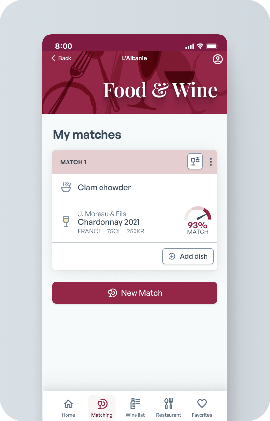
Wine & food matching
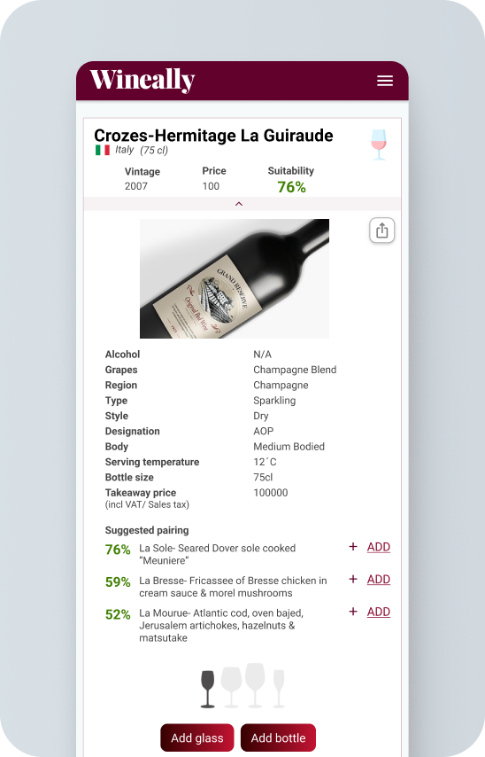
Wine details
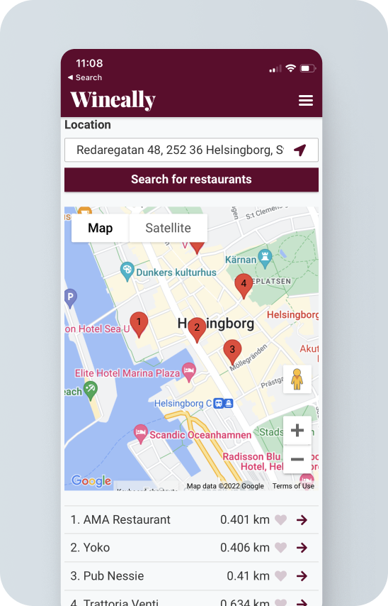
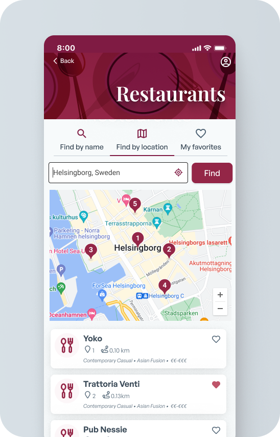
Restaurant search
Project Outcomes
The new design achieved the following:
Functionality and user flows better match the users’ mental model and are more intuitive.
The simplified interface makes it easy to find the relevant information
Styling is modern, attractive and matches the target market better
The process makes the app’s perceived value higher, as the results are presented in a more straightforward and appealing way.
Lessons learned
The simplification of the functionality and visual refresh was a step in aligning the app with user expectations, and would have hopefully resulted in better adoption of the app.
The app was unfortunately not developed to the end due to funding issues, so there was no opportunity to test it further.